THE STORY
THE SOUND OF THE CITY
Growing Uptempo represents the growth of The Orchestra Sinfonica di Milano, in terms of repertoire, audience, and the ever-growing printing house. Uptempo references not only music but also Milan's frenetic rhythms, futurism, and innovation, making it a perfect fit for the brand. To reimagine the orchestra, we embraced the Milanese musical and cultural scene, particularly focussing on the orchestra's role in making creative expression accessible.
PERFECTLY PITCHED
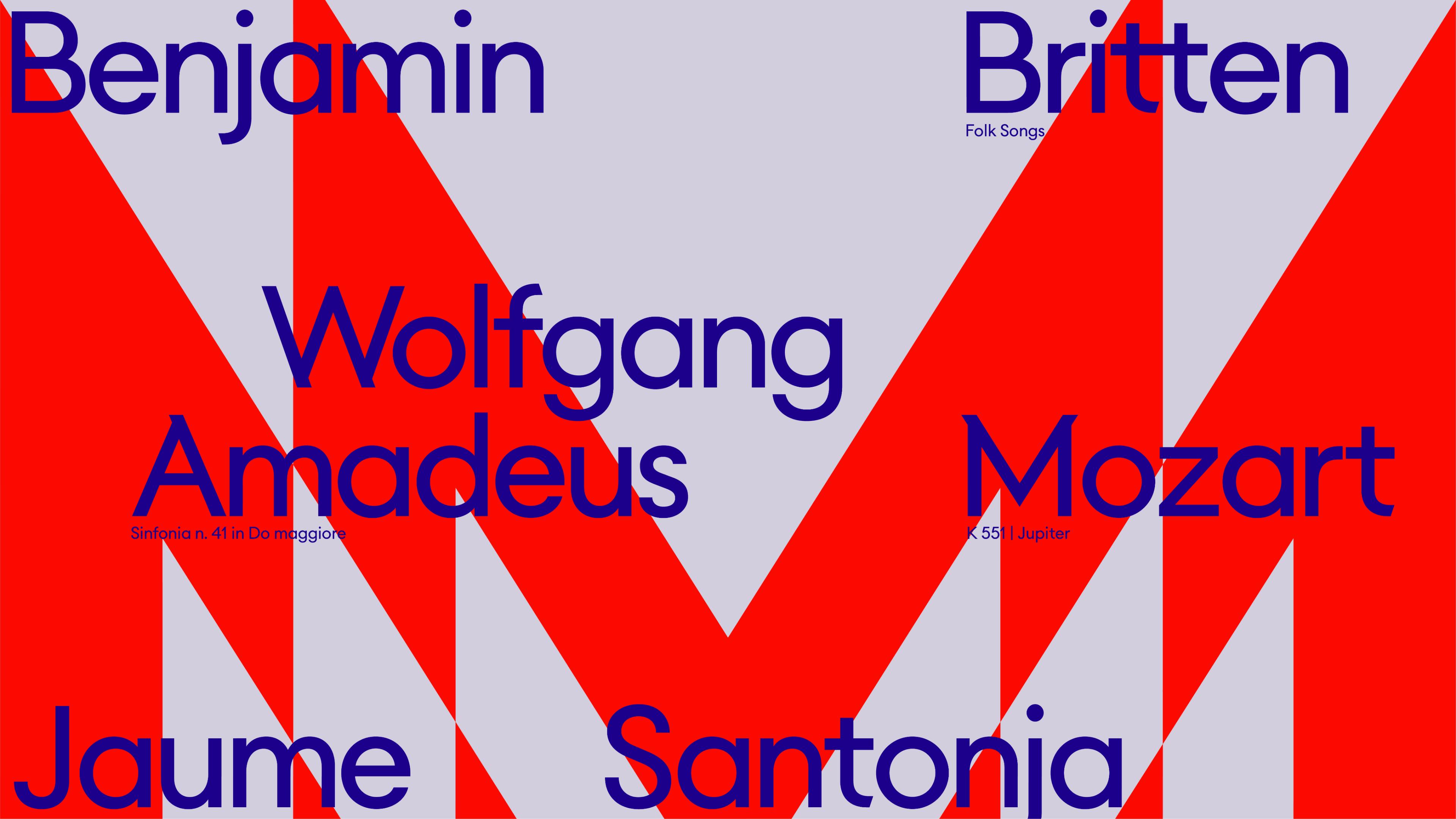
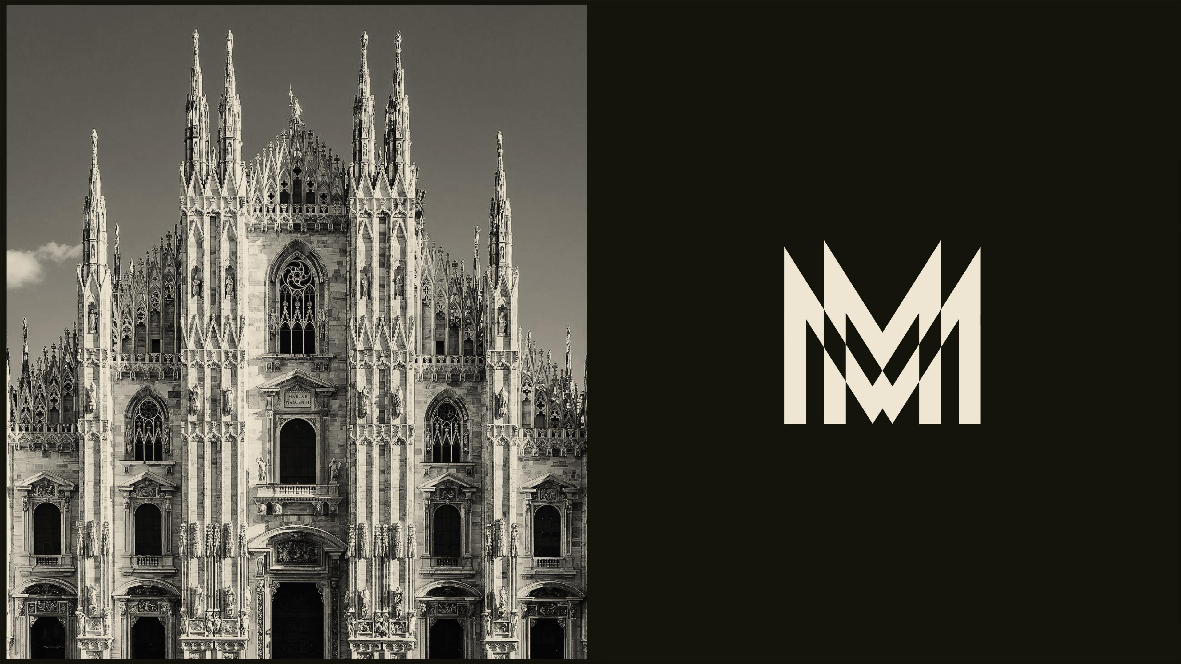
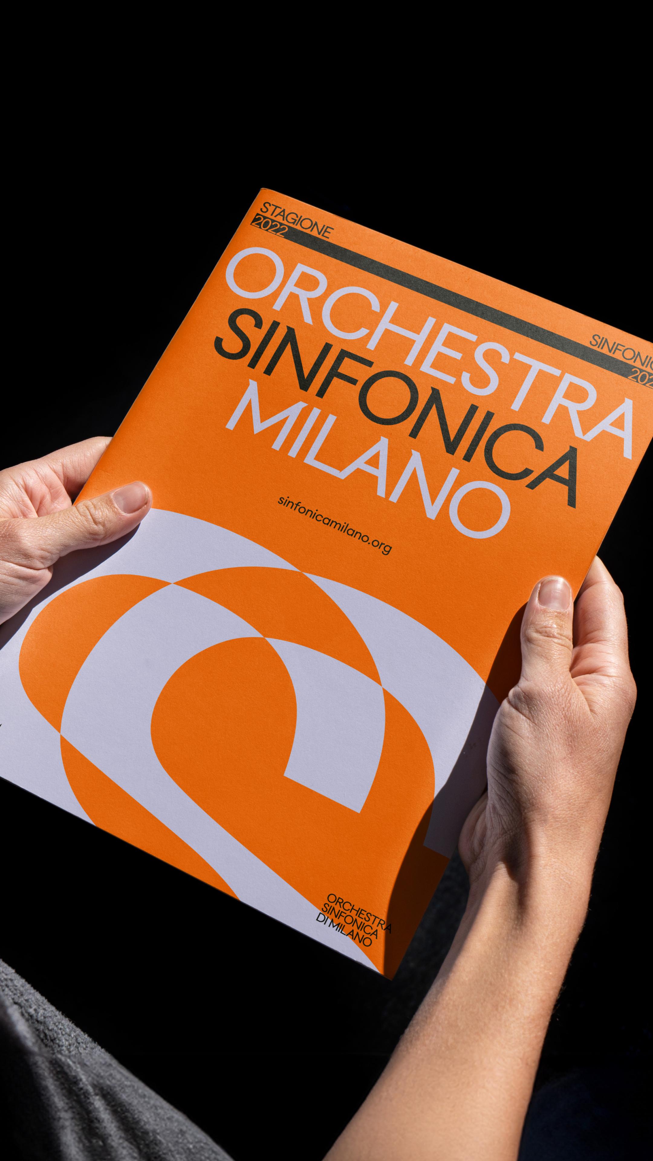
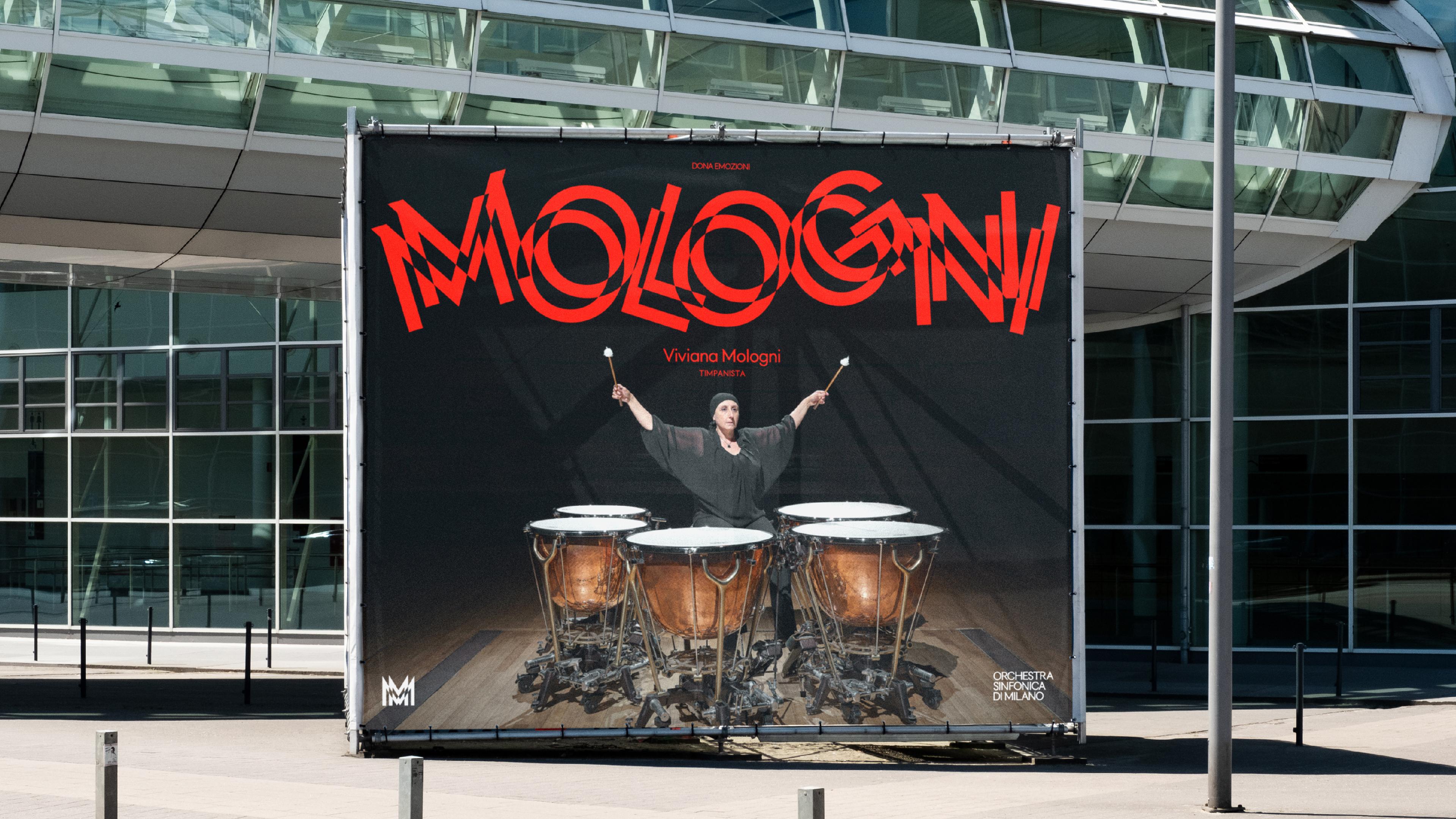
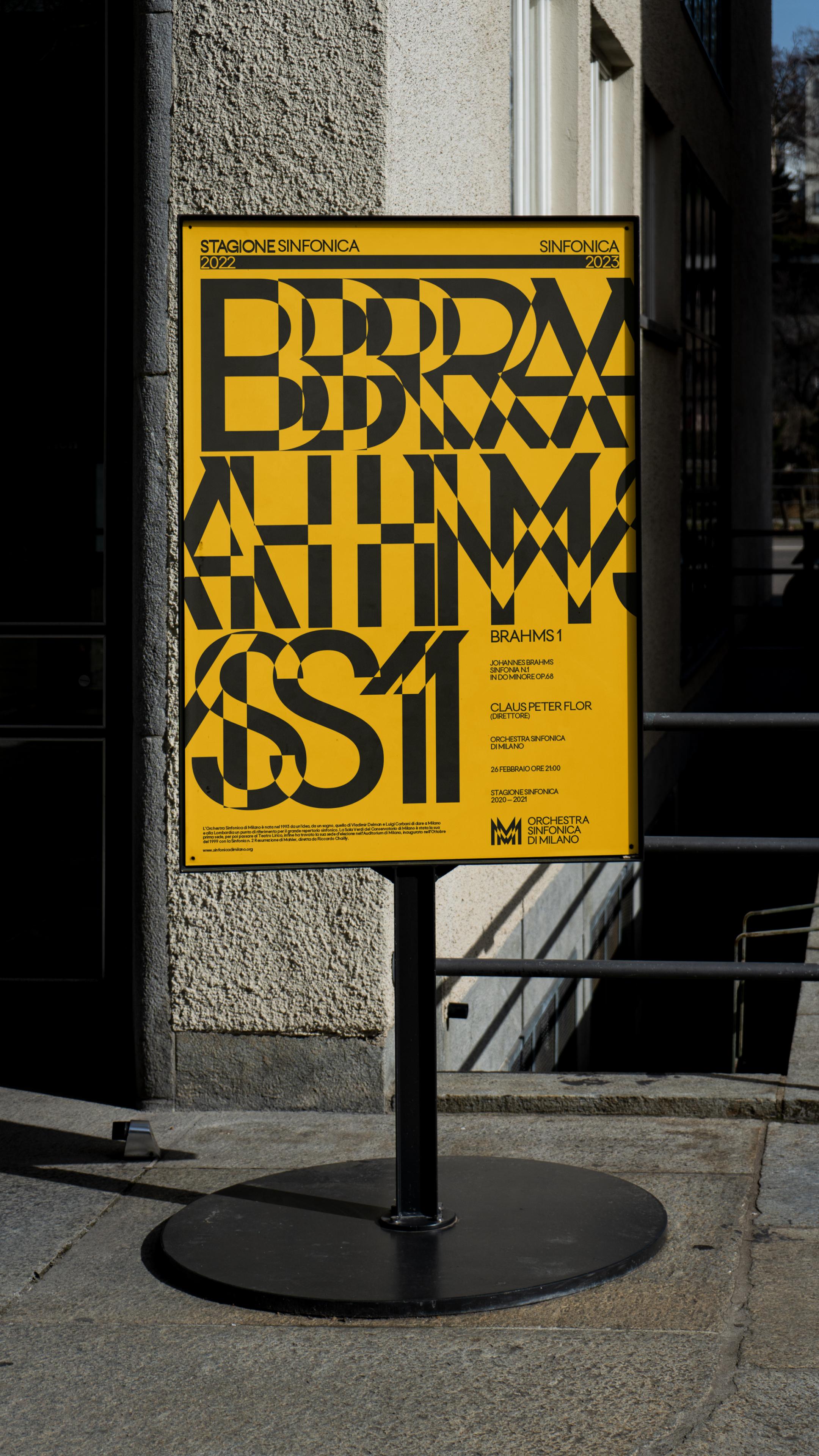
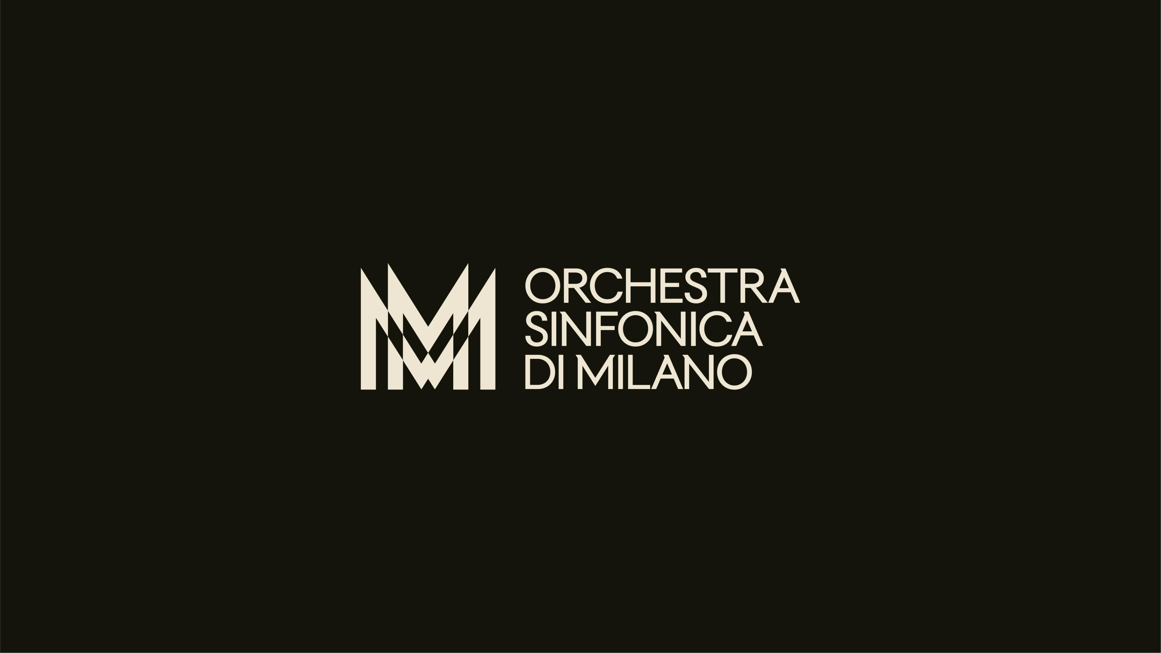
Using our in-house expertise, we developed a synaesthesia-inspired, bespoke typeface: TUMB TUMB. It was influenced by the friendly, historical design of Futura – a style commonly seen in Milan – with serifs inspired by the angular architecture of their cathedral, Duomo di Milano.
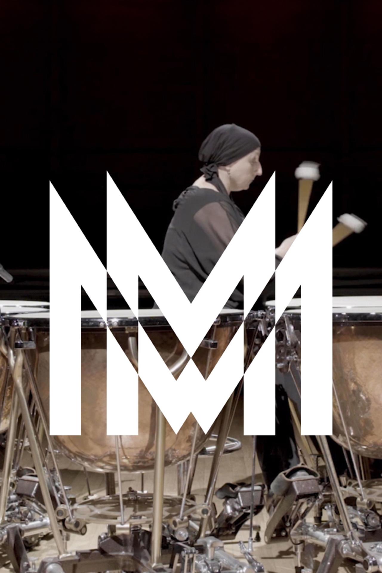
The logomark also reflects Milan's architectural forms while capturing the brand's progressive approach through digital interactivity. The logotype and typography reacts to the variety of music on offer, widening and narrowing according to the intensity of what's being played. This brings explosive energy to the identity, while visually emulating early 20th-century artworks.
20th-century art movements influenced the brand's use of colour too, employing hues from the Futurist art movement. This builds the culture of Milan into our palette, giving the brand wide-ranging expressive capabilities inclusive of every genre.
“We want to be open to the international public, being a reference point with an ownable identity” – Ambra Redaelli, President of Orchestra Sinfonica di Milano.
RESULTS
Our rebrand has resulted in a sales crescendo, with a 56.9% increase in subscription sales and tickets.
ADC Gold Cube / Brand Communication & Design / Typography
ADC Silver Cuber / Brand Communication & Design / Logos
ADC Merit / Brand Communication & Design / Rebranding
D&AD Yellow Pencil / Branding / Large Enterprise / Logos / 2023
D&AD Graphite Pencil / Branding / Large Enterprise / Brand Refresh
D&AD Graphite Pencil / Type Design & Lettering / Single Typeface
EuroBest Gold / Design / Rebrand / 2023
TDC Communication Design Motion /Kinetic Typography /Single: “Certificate of Typographic Excellence”
The One Show / Bronze Pencil / Design Typography / Dynamic In Motion
The One Show / Bronze Pencil / Design Brand Identity / Rebranding
The One Show / Merit / Design Brand Identity / Logo
European Design Awards / Silver / Typographic Applications
European Design Awards / Gold / Motion Logo
European Design Awards / Best Of Show
Cannes Lions Shortlist / Design / Rebrand / Refresh of an Existing Brand / 2024
EPICA Gold / Brand Identity / 2024
EPICA Grand Prix / Design / 2024